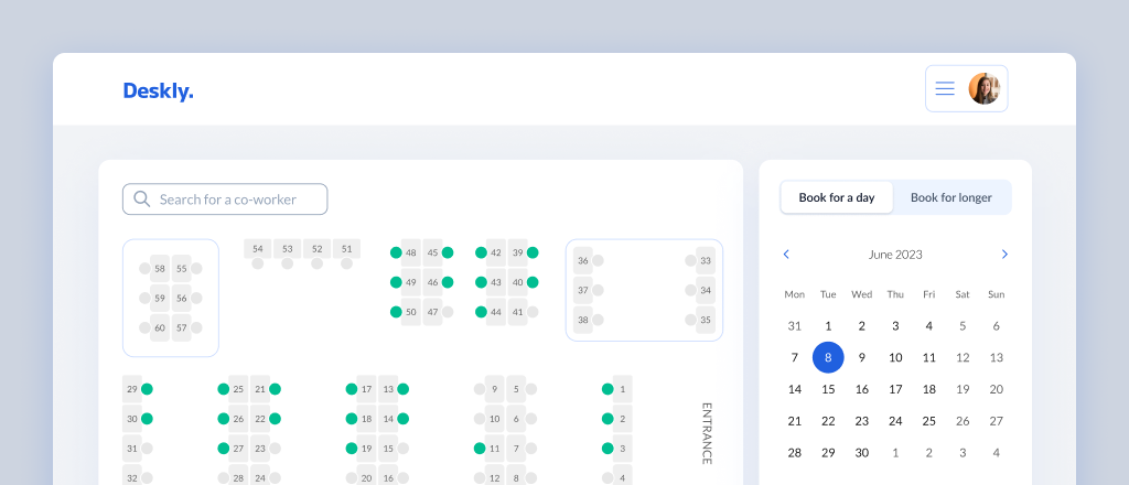
How did I design a platform for desk booking?
Project type: Personal created for portfolio purposes
Problem Statement
After the pandemic, more and more employees work from home. They appear in offices only on selected days or only to integrate with the team. Since there is no longer such a demand for office space, companies decide to cut costs and reduce them. Employees in such a situation do not know if they will find a place to work when they come to the office because usually there are fewer places to work than employees.Possible Solution
An application that allows employees to book a desk in the office for a specific day.Project Goal
My goal is to design screens for MVP of the new application for desk booking, taking into consideration observed good practises and problems in an audit of the Odra app (Monterail company desk booking app). The new application will no longer be associated with the Monterail brand, it will be a separate platform and will be dedicated to companies that need a desk booking system. I will try to repeat good practises and avoid mistakes observed during an audit of the Odra app and based on the research (UX Audit, Competitive analysis, and Interviews with users) I will decide what features should be included in the MVP of the desk booking app.Scope of work
- UX Audit
- Competitive analysis
- Interviews with users
- Deciding what features to include in MVP of app
- Personas
- Information Architecture
- User flow
- Lo-fi wireframes
- Hi-fi wireframes
- Usability tests
Project duration
2 weeksUX Audit
Odra app is Monterail company desk booking app. I was using it for a year when I was working in Monterail company. When I have participated in the recruitment process for Monterail company, as a recruitment task, I was supposed to perform a short UX audit of Odra app and design a solution to one of the observed problems.For this project I have decided to conduct full UX Audit of this app (I have learned a lot during this year and now I wanted to make the audit one more time in a more proper way). When designing my application, I have tried to avoid errors and repeat good practises that I found while auditing the Odra app. For the UX Audit of the Odra App, I have decided to use the Cognitive walkthrough method. I distinguished the following 4 flows from the application:
- Creating a new booking
- Checking booking history
- Going to My reservations
- Editing an existing booking
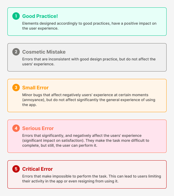
Below an example of one screen from my audit.
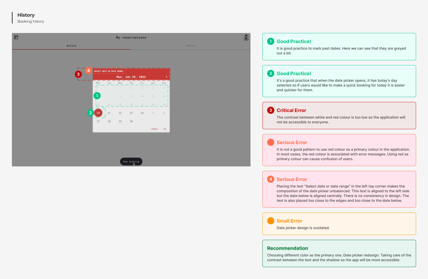 Click here to see full audit in Figma file
To sum up the audit of the Odra app I have chosen good practices which I would like to repeat when designing my app. I have also chosen the biggest mistakes from the Odra app and wrote advice for myself about what I should remember to not repeat those mistakes.
There were many good practices that I observed in the Odra application. I will describe two of them below.
- The first step in the process of booking the desk is choosing the date for which we want to make a booking. When we move to the next steps, we can still see this date on the screen. This is in line with the 6th rule of Usability Heuristics - "Recognition Rather than Recall" which tells us that we shouldn't force users to remember elements, actions, and options but make them visible.
- Users can also change this date during any step. This is in line with the 3rd rule of Usability Heuristics - "User Control and Freedom" which says that users make mistakes often and we should design easy ways to fix them.
I have found many mistakes in the Odra app. I will mention two of them.
- The process of desk booking has been divided into a lot of steps, which makes it complicated and long.
- The app is not accessible. The contrast between the text and background in the calendar viiew is too low. There are some elements e.g. chevrons that are so small that are almost unnoticeable.
Competitor analysis
I have made the competitors analysis to see what features other desk bookking apps offear and what are their strenghts and weaknesses.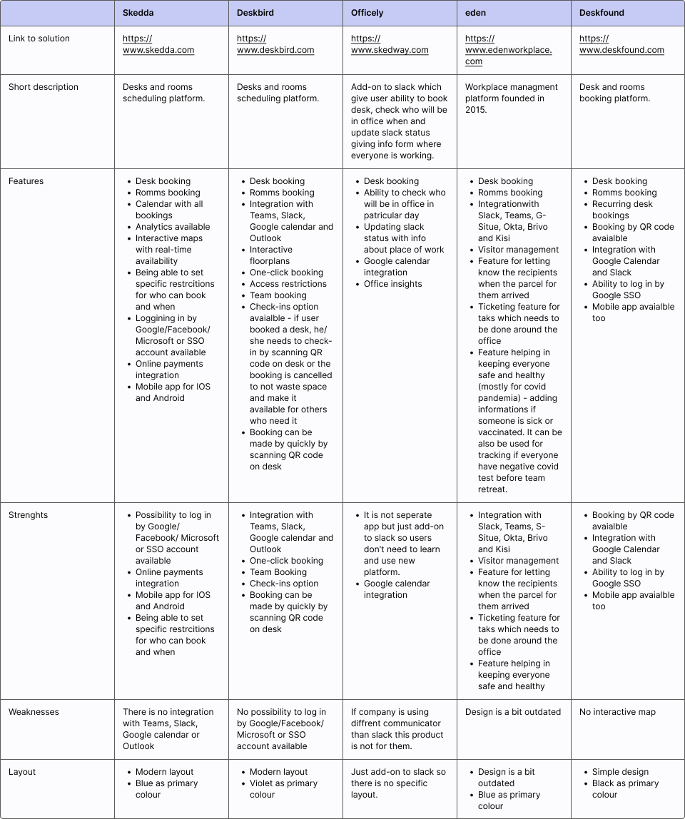
In-depth interviews
I have conducted interviews with 4 users of a desk booking systems. Using the past or current desk booking app was the only criterion that I used while looking for participants for this interview. Through the interviews, I wanted to find out how users make reservations, what habits they have related to this activity, and what features applications they use are offering. I wanted to know also what is important for them in the process of booking a desk and what features in desk booking apps are important for them and which are useless. As I wanted to get precise answers from users I was asking about their last experience with booking the desk. I have gained many insights from interviews. I will mention two of them:- There was no possibility of booking rooms in any of the applications used by users, but all users agreed that it would be a useful and helpful feature.
- All users missed in the application they use an interactive map on which they could see the entire floor and be able to click on a specific place, and simply book it.
MVP features
After the research phase, I have decided what features, I will include in the MVP version of my application. Below are features that I chose for MVP and an explanation of why I chose them:- Being able to book a desk for a specific day by use of an interactive map - I chose this feature as all users in in-depth interviews agreed that they miss this feature in apps they use.
- Being able to cancel reservations - As I mentioned earlier according to the 3rd rule of Usability Heuristics - "User Control and Freedom" users make mistakes often and we should design easy ways to fix them.
- Being able to see who is sitting where on the map - I chose this feature as being able to see where favorite co-workers are sitting was an aspect mentioned by all users in interviews as an aspect taken into consideration when deciding where to book the desk.
- Being able to see current reservations - I chose this feature as according to the 6th rule of Usability Heuristics - "Recognition Rather than Recall" we shouldn't force users to remember information like this but rather make it visible.
- Web app accessible on desktops - I decided that the application in the MVP version will be a web app accessible only on desktops. I have made this decision as users during in-depth interviews said that it would be nice to have a mobile app but it is not the must-have for them as they are making bookings during work while using the laptop, so probably even if they would have a mobile app, they would use a desktop version in most of the cases.
Proto-Personas
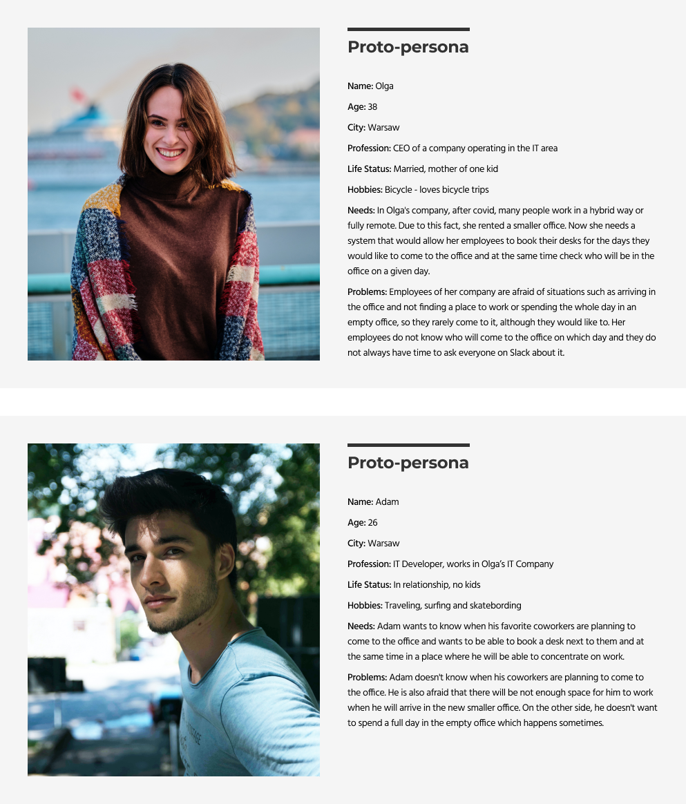
To better understand who the users of my application will be and to be able to identify with them more during the design phase, I decided to create Proto-personas. I call them Proto-personas because they are based on my hypotheses and interviews with users of other desk booking applications.My Proto-persons will need validation with the market and confirmation of the assumptions after the application release.
I created two Proto-personas because I wanted to create a representative of the direct client of my application - company owners who need a desk booking system, and an indirect client - employees of these companies who will use my application.
Information Architecture
To better organise the content and flow of my application and to understand what screens I need to design I have created Information Architecture.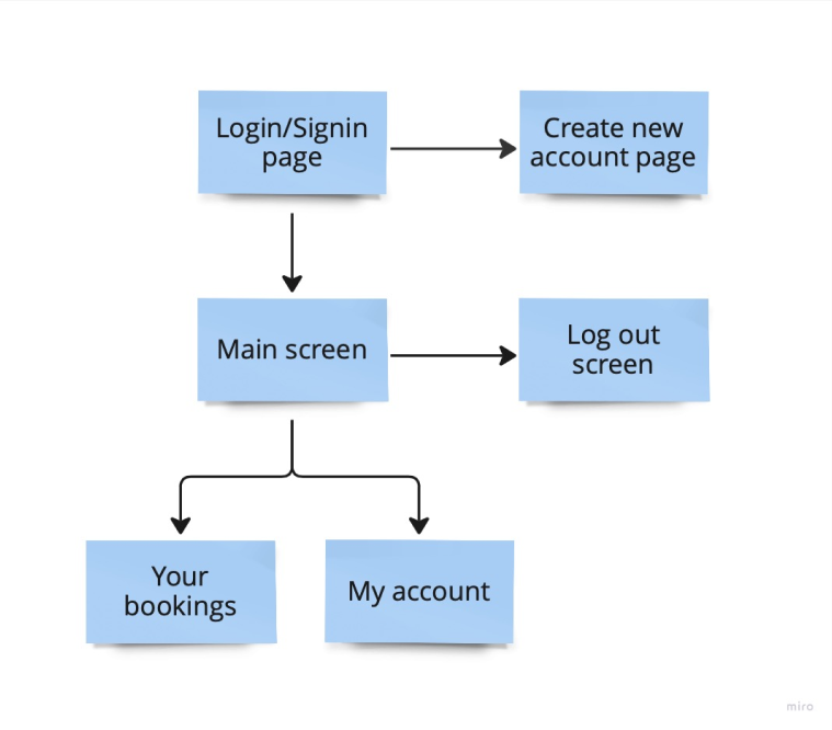
User flow
To understand better what flows I need to cover I have created user flow.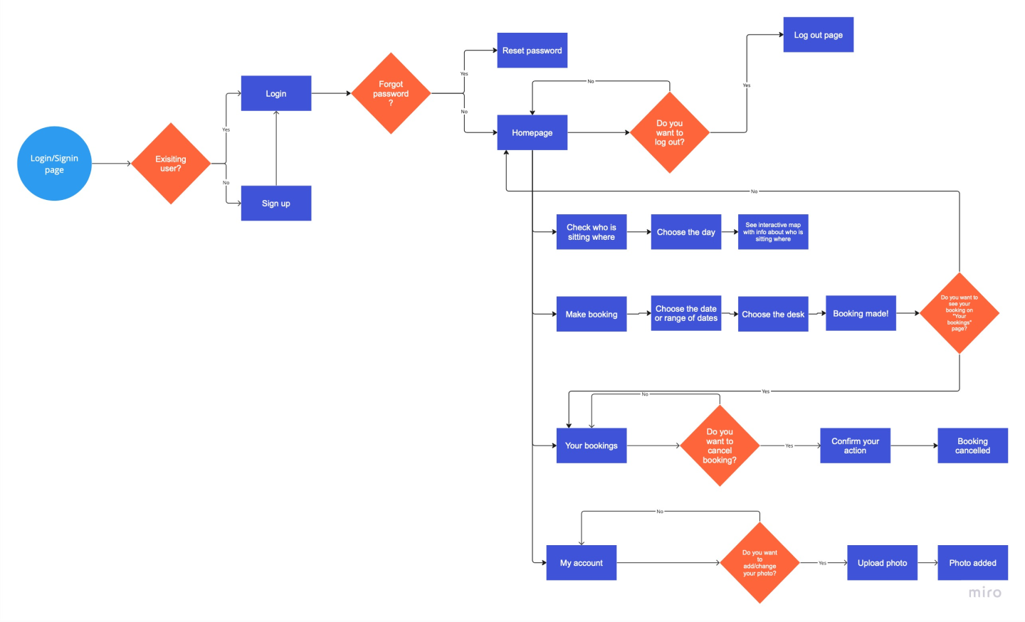
Sketches
My next step was to prepare quick sketches with my ideas for screens that I needed.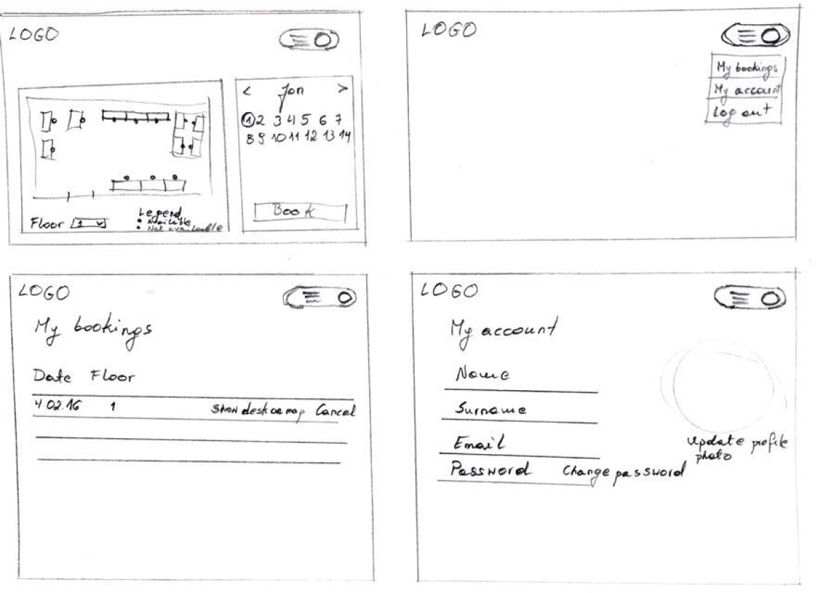
Final UI
Then I transferred my ideas to Figma and below you can see few screens with final UI.
Design System
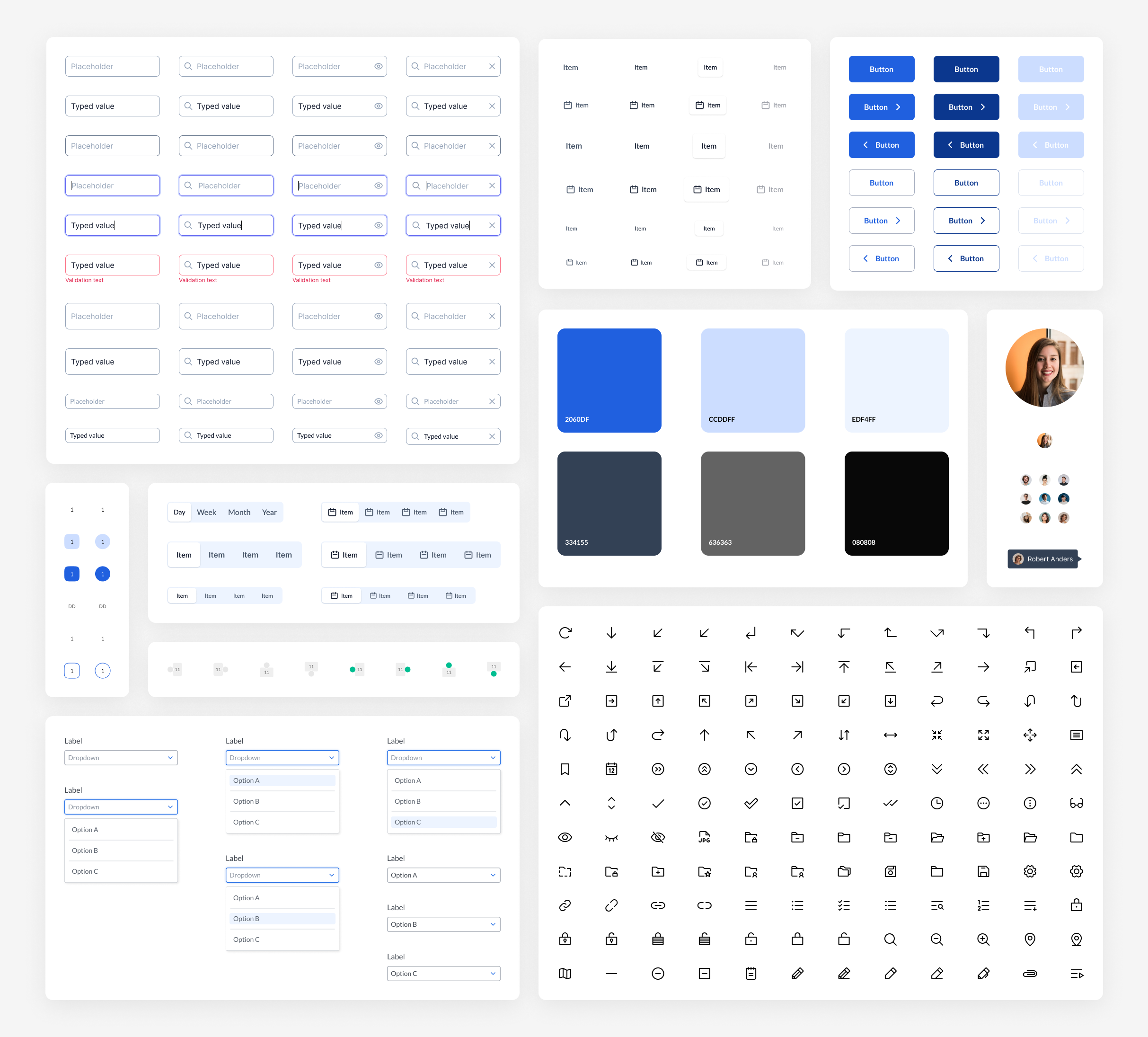
To speed up work on the project, I used components available in free source design systems. It was very important to me that all elements were consistent with each other.