My design journey: login and sign-up process for an online course platform
Research
I began the project by doing research. I looked at the sign-up and login processes of various competitors in the market, both on mobile and desktop. Here's a snippet from my research - the login and registration flow in the Udemy app.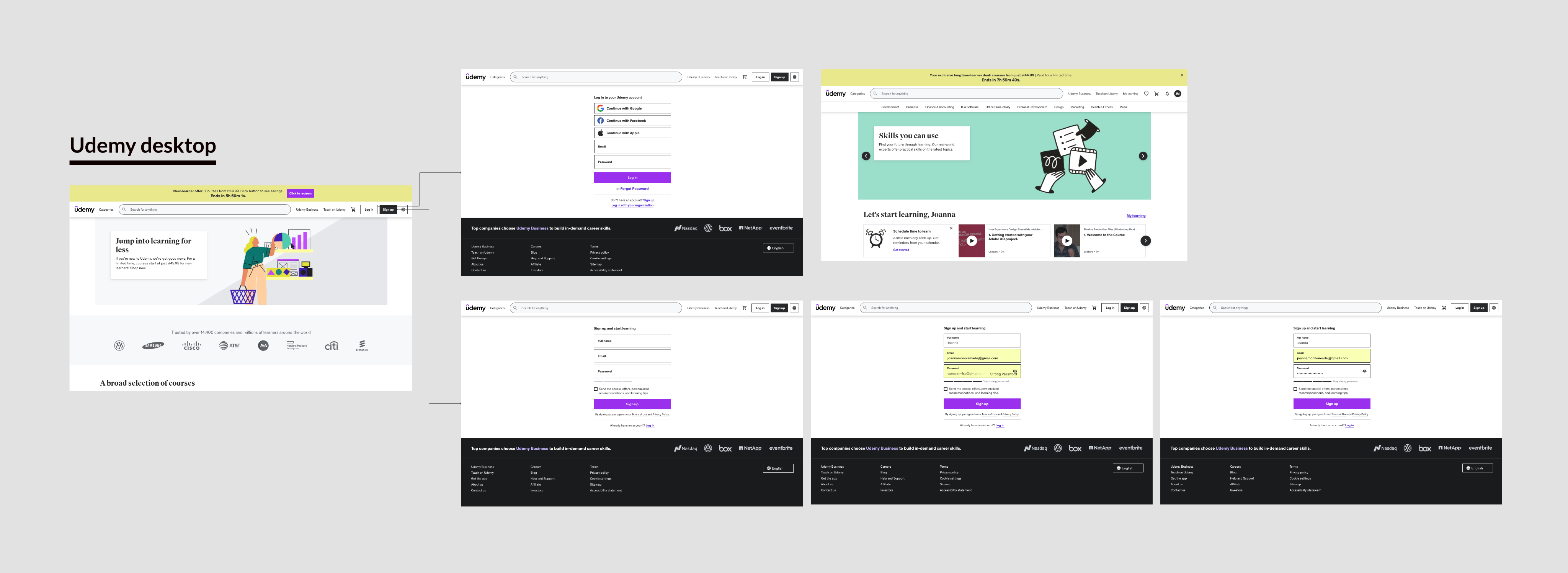
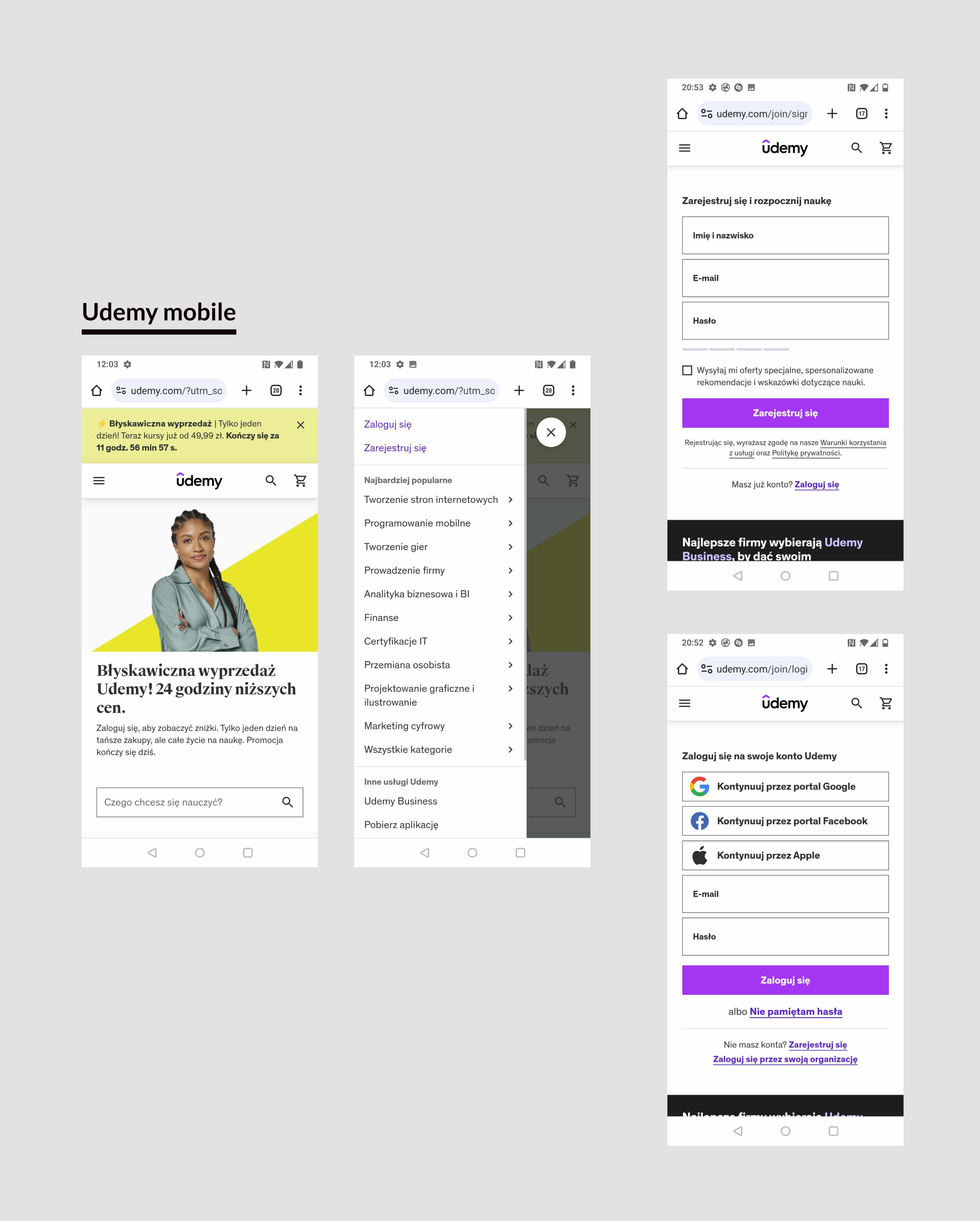
Next, I read some articles about best practices in the login and registration process. I wanted to learn from the best sources, so I focused on articles from the Nielsen Norman Group and the Baymard Institute. Here are a few articles I used for insights:
- A Checklist for Registration and Login Forms on Mobile
- Login Walls
- 19 Ways to Simplify ‘Sign Up’
- 9 Ways to Simplify ‘Sign In’
Sketches on Paper
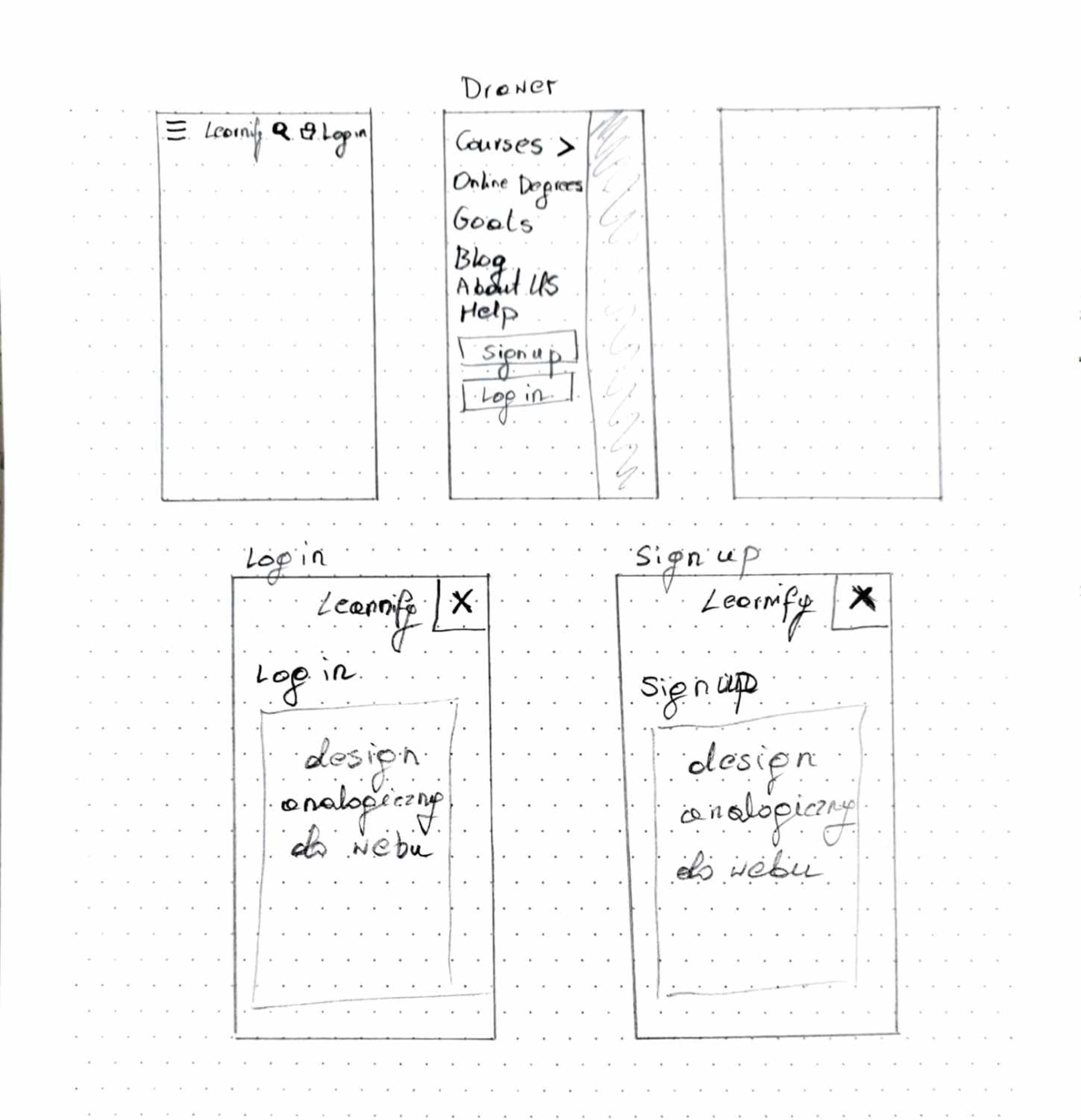
After understanding good practices for designing the registration and login process and studying how these processes work in other companies, I started sketching out the flows on paper. On the pictures below you can see my sketches.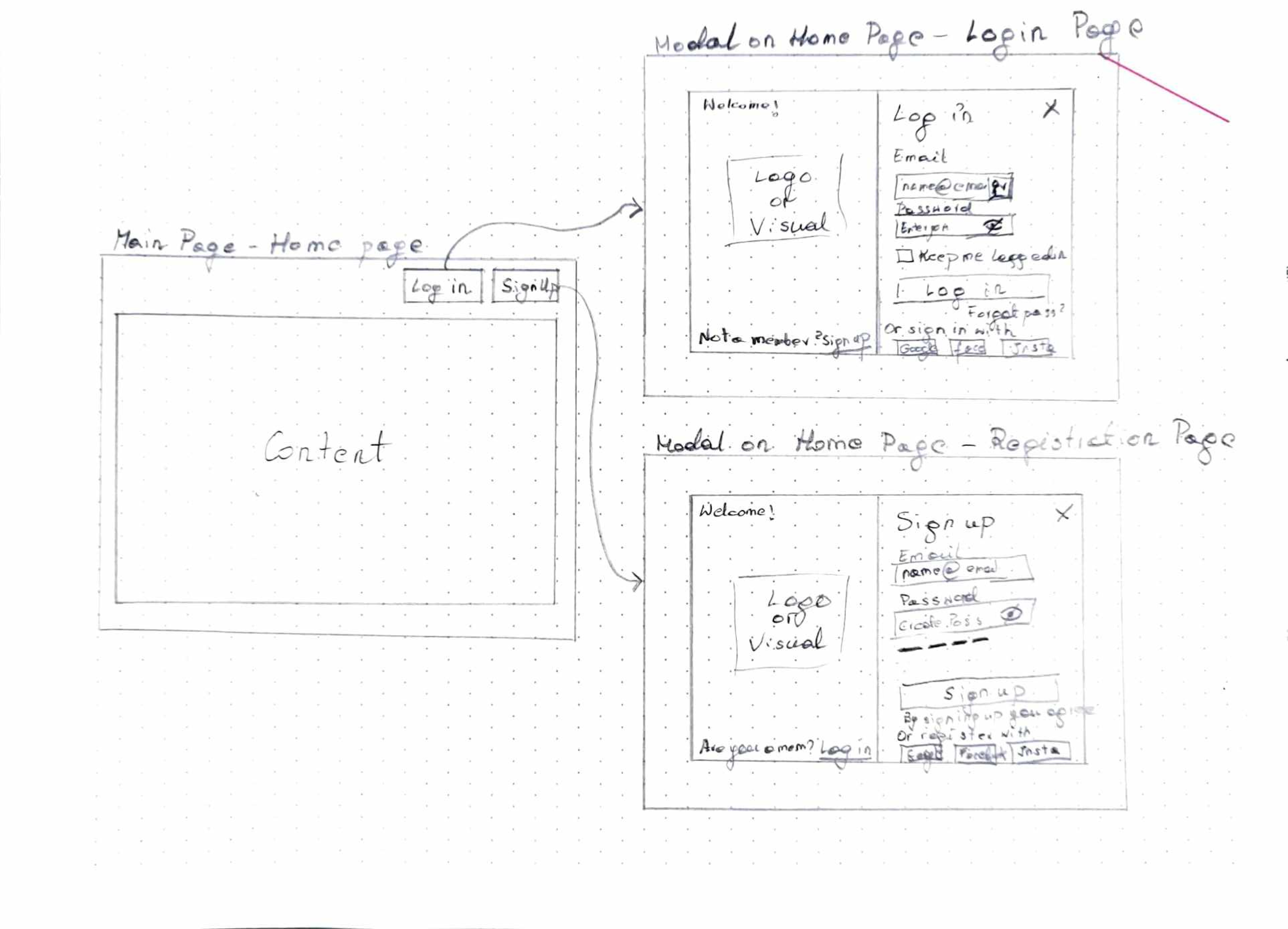
UI Screens
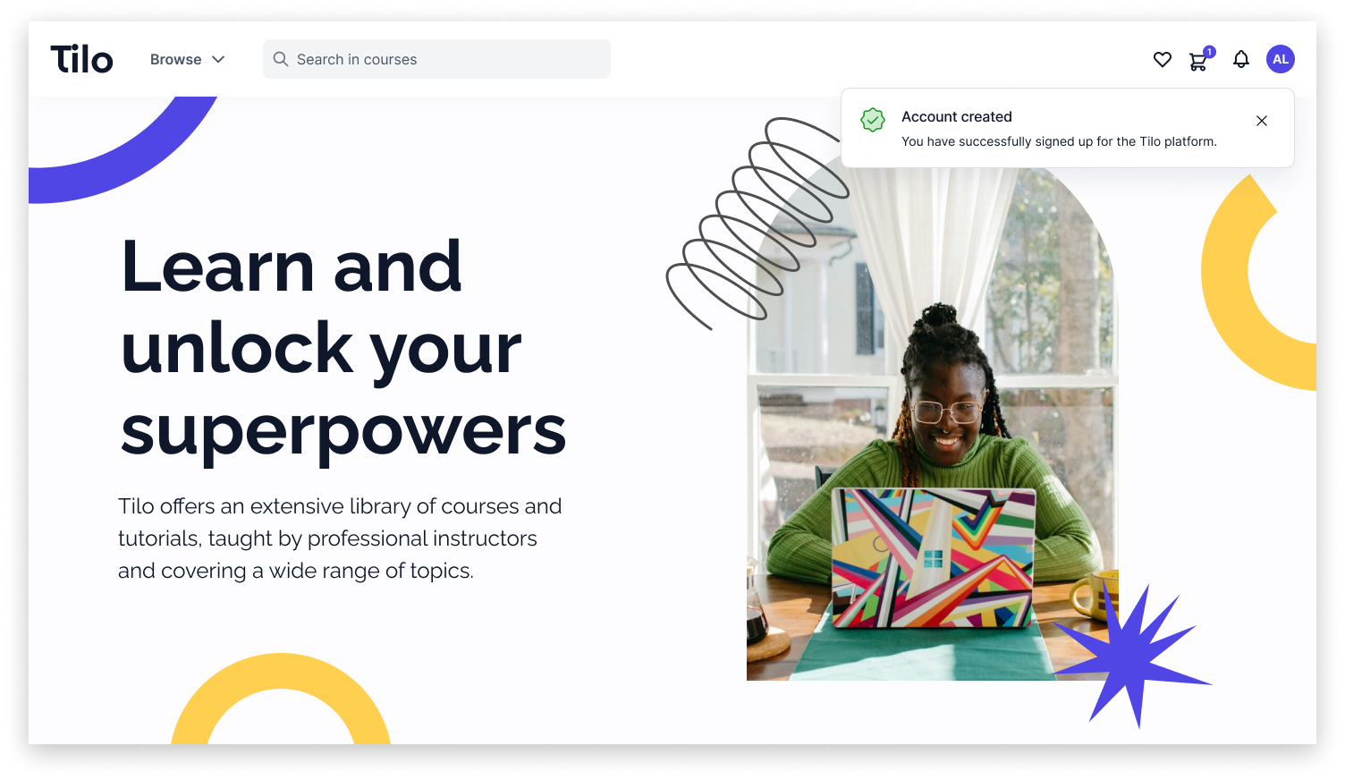
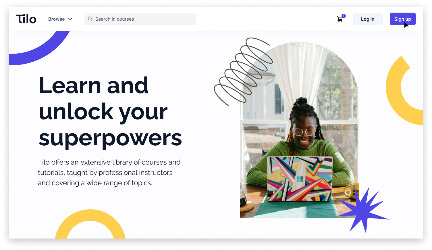
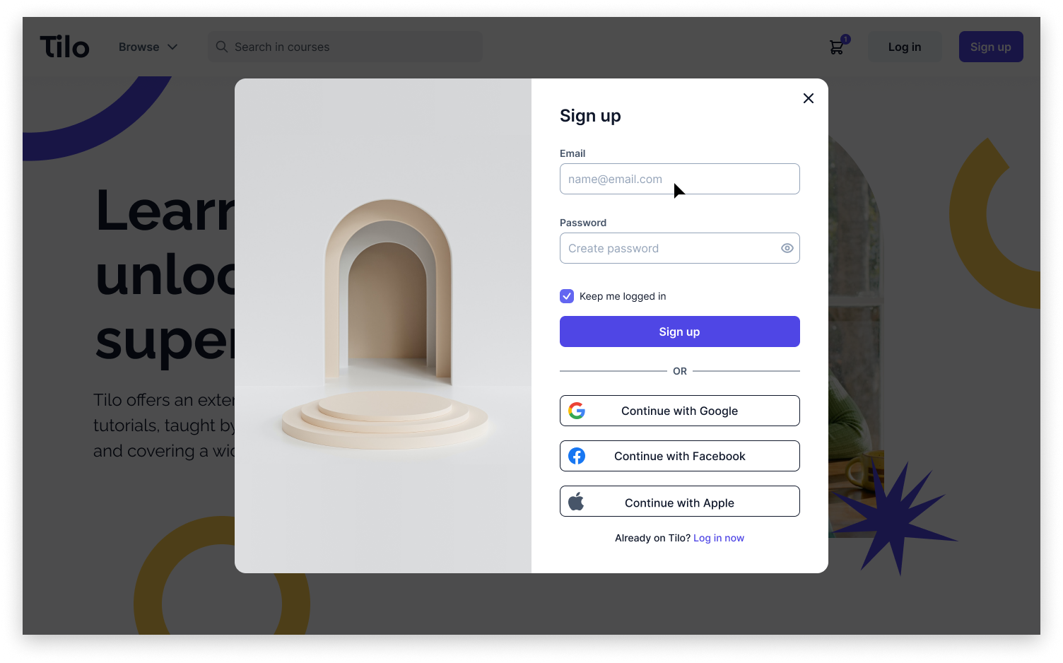
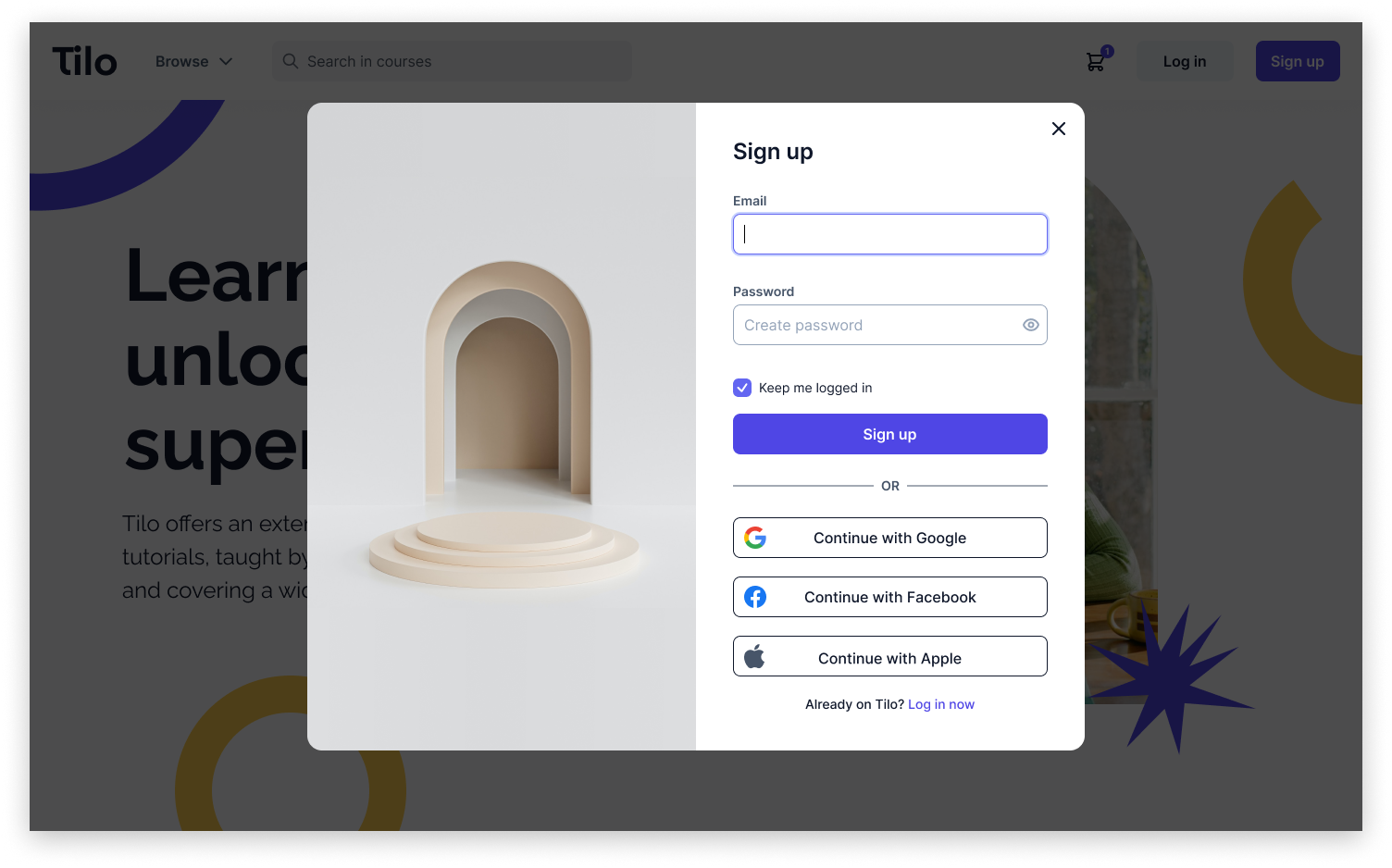
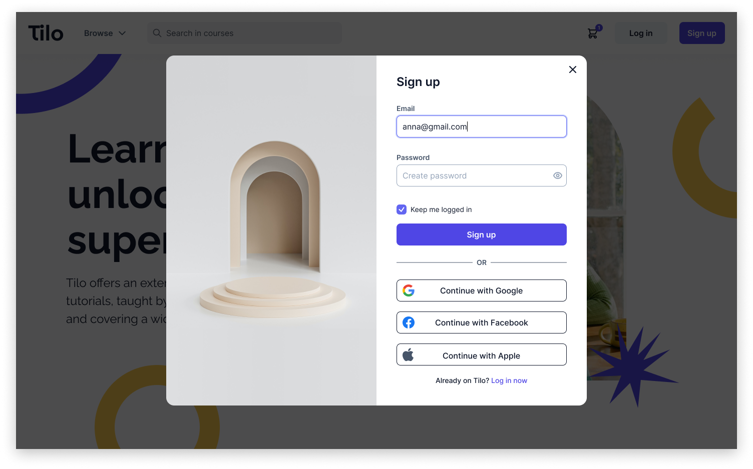
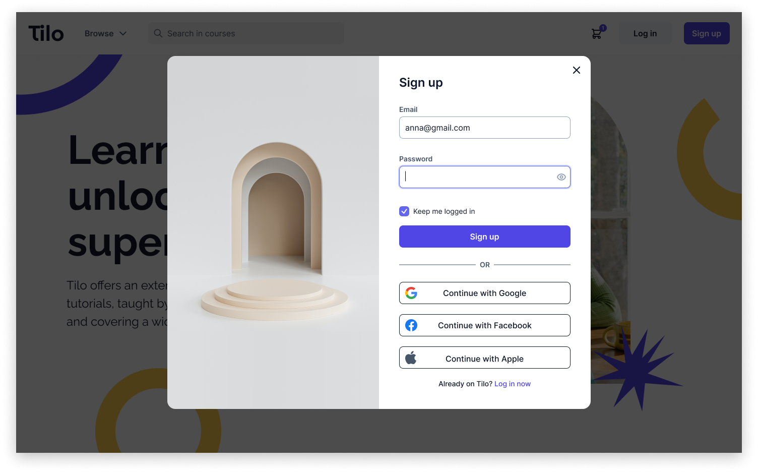
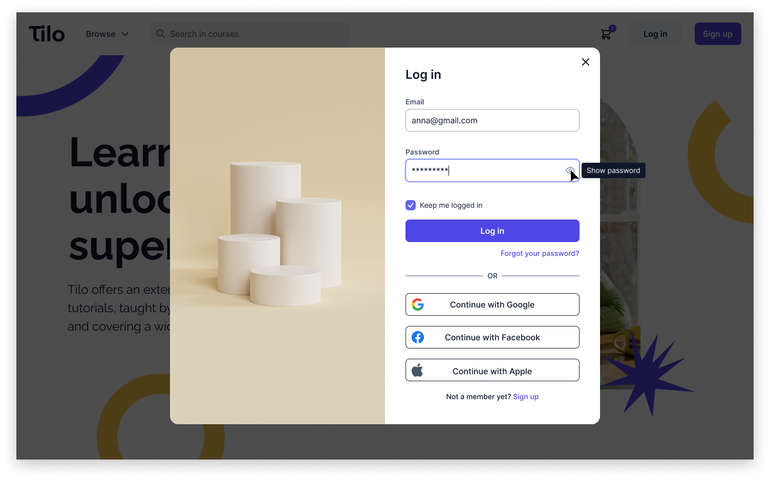
My next step was to transfer my sketches into wireframes in Figma. Below, you can see screens from the registration flow which I have designed.My goal when designing the registration process was to make it as short as possible in order not to discourage the users and not waste their time. I only request essential information necessary to create an account. If users want to share more about themselves, they can do so after creating their account, for instance, in their profile section. To achieve this goal, I am not asking the users to to re-enter their email and password. However, since it's known that users make fewer mistakes when they can see their password (NNGroup), I've added an option to reveal it, while keeping it hidden by default for user safety. I've also skipped the requirement for users to confirm their registration by clicking on an email link, as it would unnecessarily prolong the registration process.
I assumed that the Tilo application would not store sensitive user data, so I do not require a specific password length or the inclusion of special characters during registration, but if it turns out that we want users to use stronger passwords, I'd include clear rules on the registration screen regarding password criteria.
In the registration process, I ask users for their email address instead of a username, simplifying the login process by eliminating the need to remember a unique username created solely for this platform.
In addition to the flow, I've also prepared additional screens showing specific situations and validations that can occur. In the screen below, we see a situation where the user has Caps Lock on while entering the password.

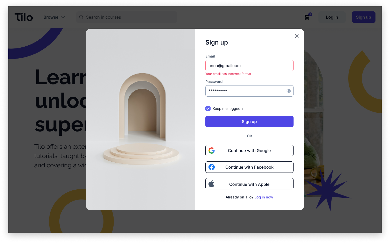
In the following screen, we observe a situation in which the user entered an email in an incorrect format and clicked the "Sign up" button.
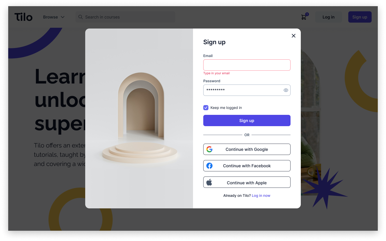
In the two screens below, we see a situations in which the user didn't enter on first screen an email and on second password and pressed the "Sign up" button.

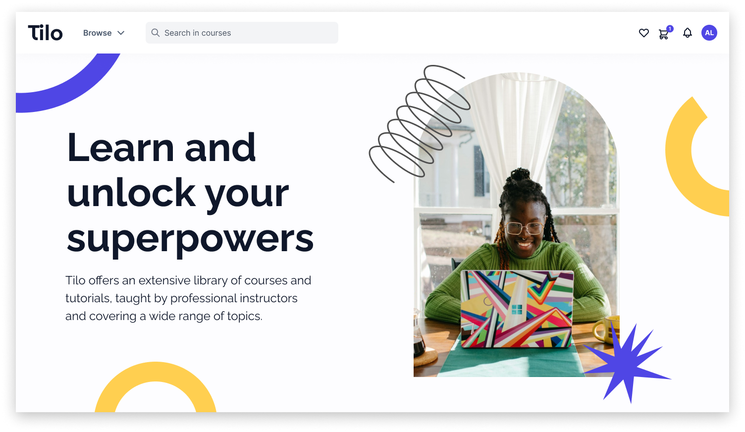
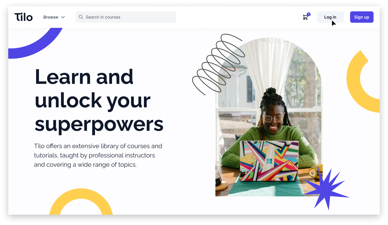
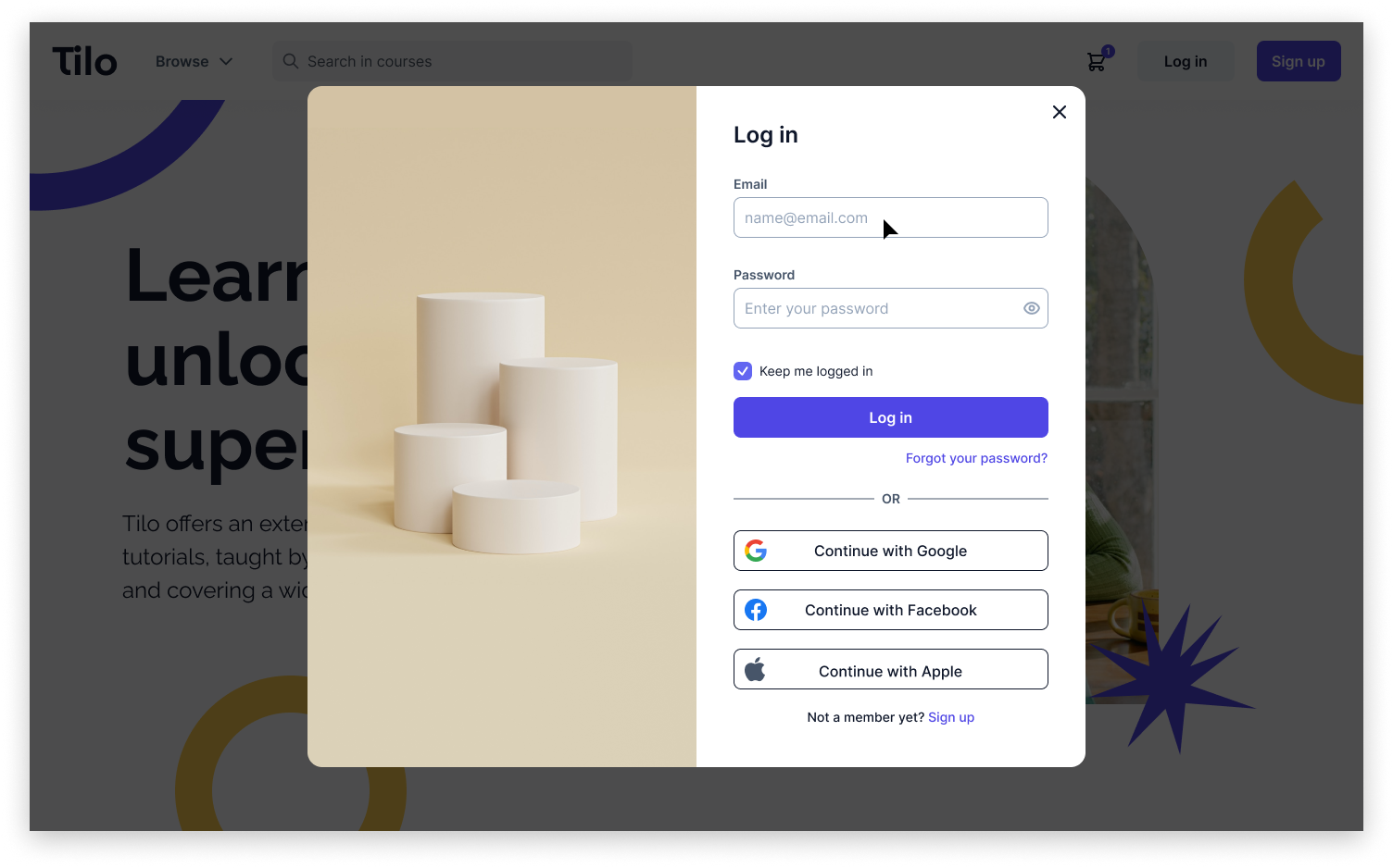
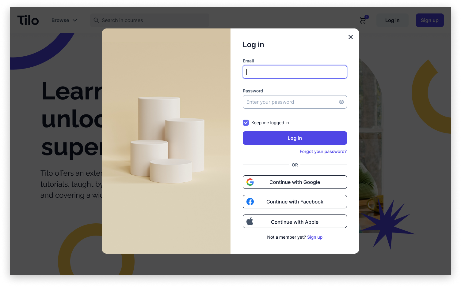
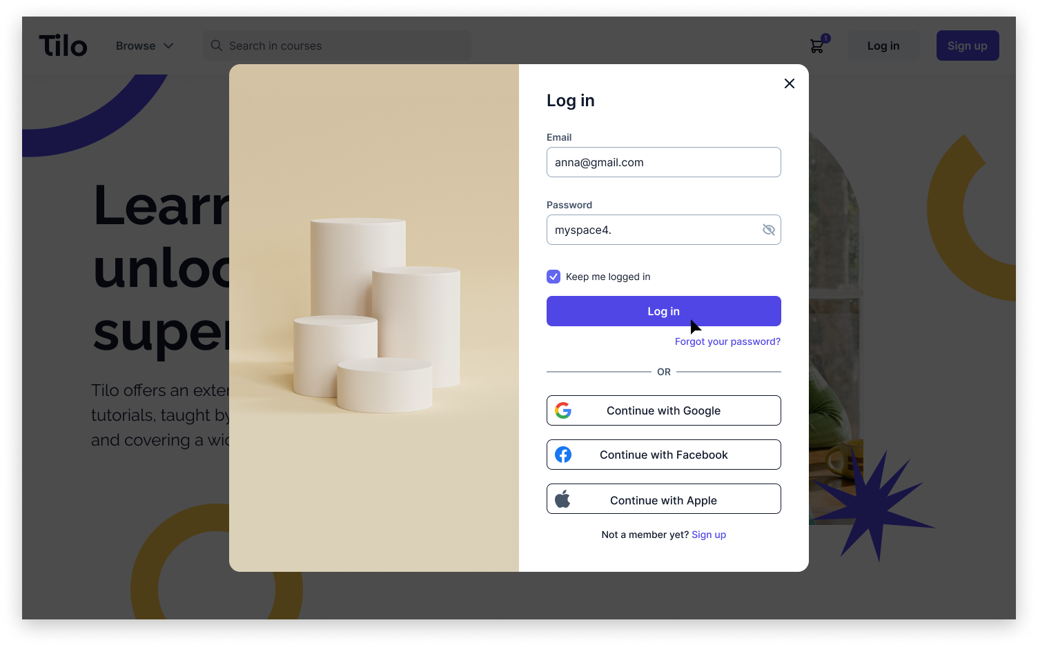
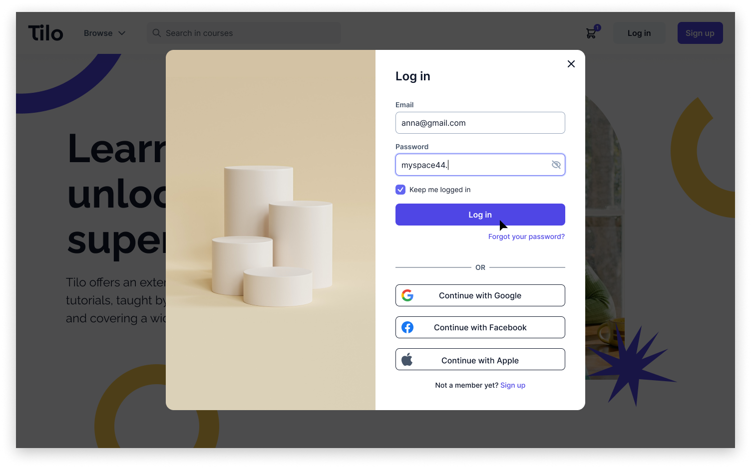
Below, you can see screens from the log in flow.
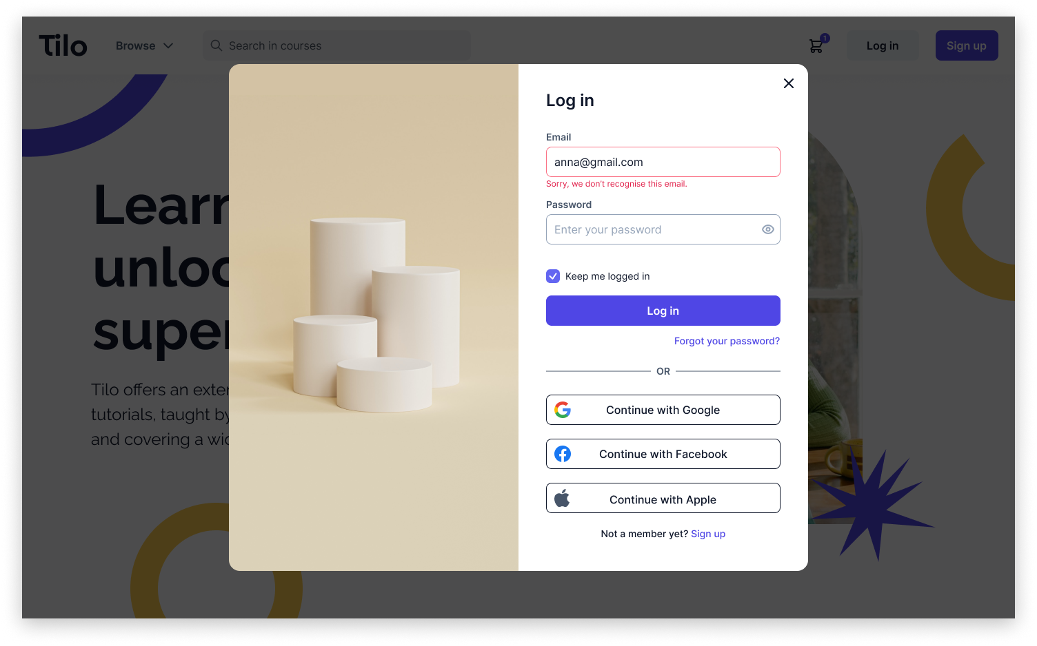
In the log in process I wanted users to know immediately if they are making a mistake in the email so when they enter an email and then press enter/tab or exit focus mode in the email field, the system will check whether the users with a given email have an account on the website. If not, users will immediately see an error message. Screen with error message can be seen below.
I also placed the button with the copy "Forgot your password?" on the login screen so if the users forget it, they will be able to easily set a new one.
If users happen to make a mistake when entering their email or password, the information they've typed won't disappear once it's checked. This way, if they accidentally make a typo, they can simply fix it without having to re-enter all their details from the beginning, saving them time and frustration.
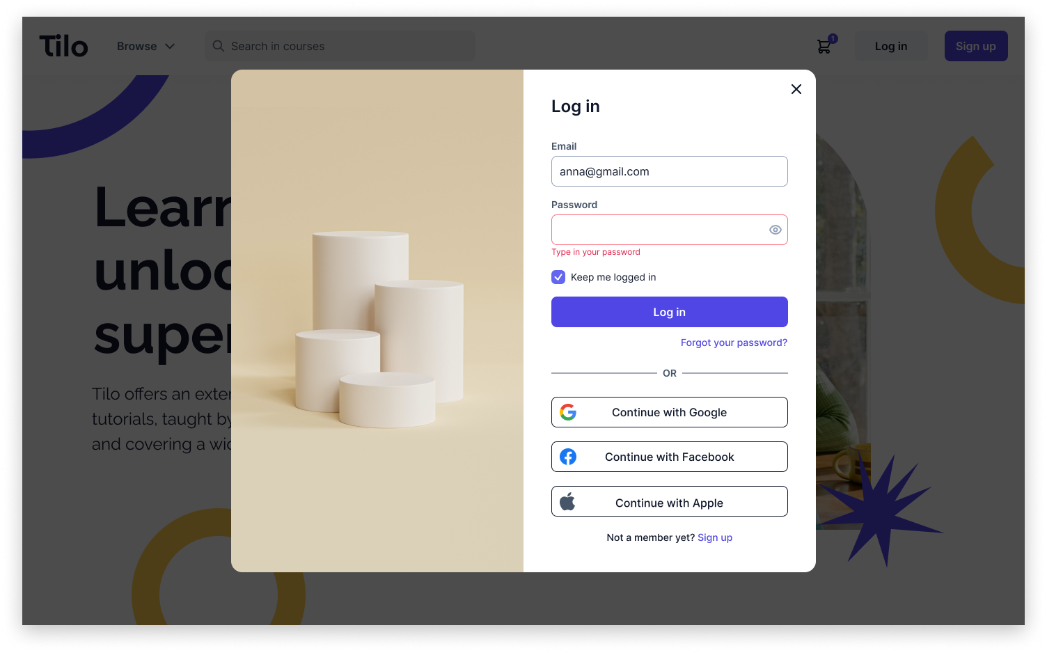
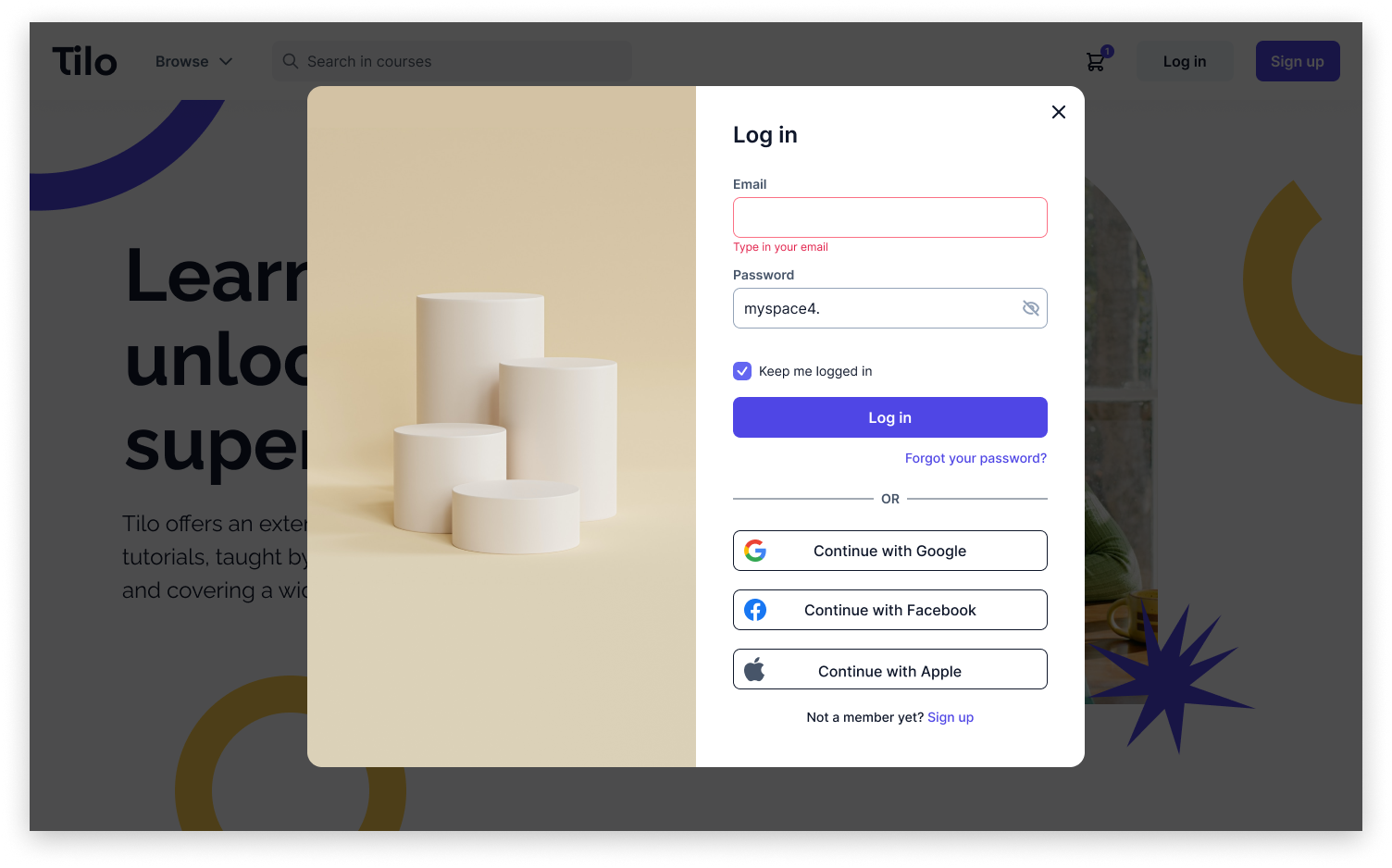
For the login process, I have also prepared additional screens showing specific situations and validations that can occur. Below you can see the screens, in order: on which user typed in the email in incorrect format, on which user has Caps Lock on when typing the password, on which user didn't fill email field and clicked the "Log in" button, and on which user didn't fill password field and clicked "Log in" button.
Both on the screens of the registration process and login process, I placed an easy option, at the bottom, to move from one process to another. I have done it to make switching easier for the users who made a mistake and chose the wrong option.
To make both processes easier for users, especially on mobile phones where entering the password takes almost twice as long as on a computer (NNGroup), I included the possibility of logging in and registering via a Google, Facebook, or Apple account.
To minimize the need for the user to log in whenever they enter the application, which may be inconvenient, especially on a mobile phone, I added a checkbox with the "Keep me logged in" option on the log-in and sign-up screen.
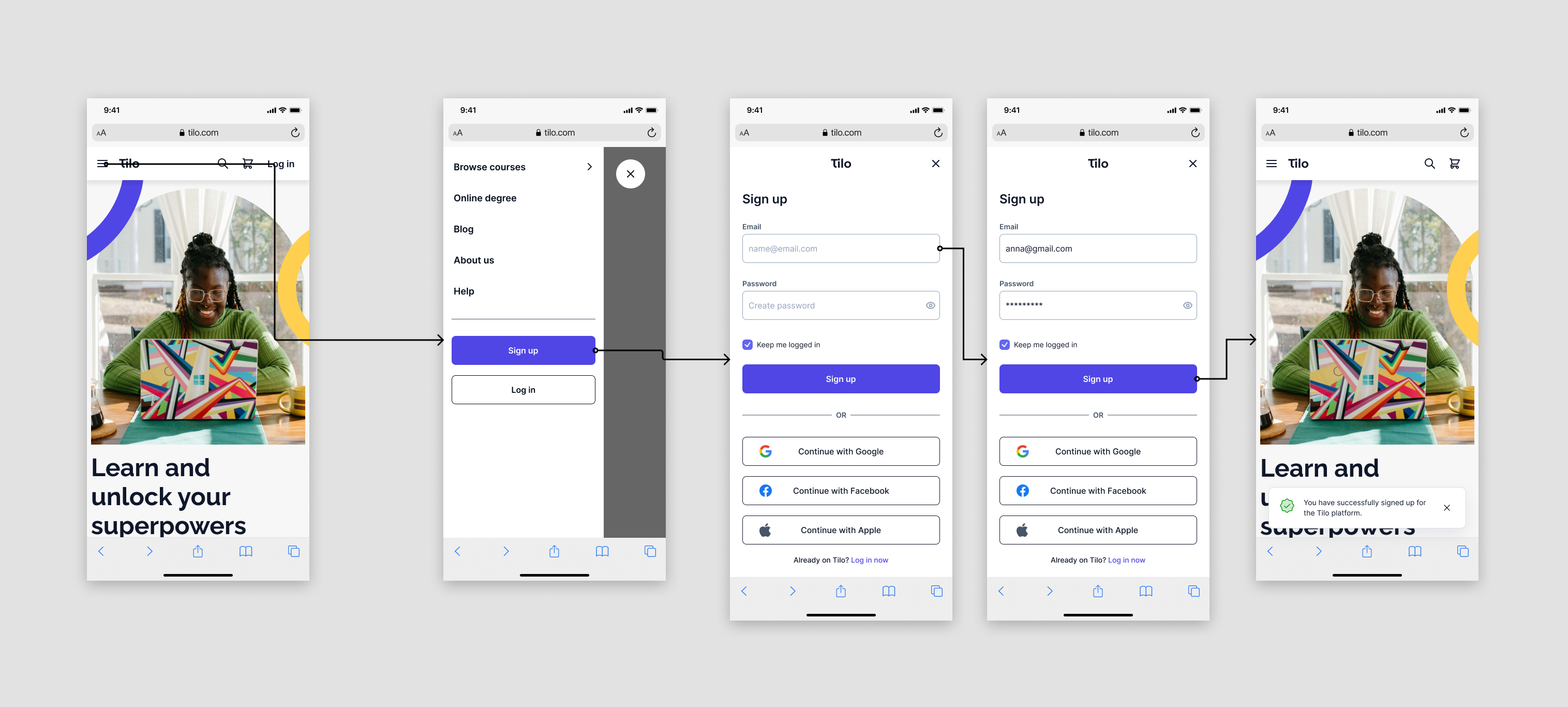
For both processes I have prepared also designs for mobile screen size. Below we can see the mobile Sign-up flow.
Below we can see the mobile Login flow.
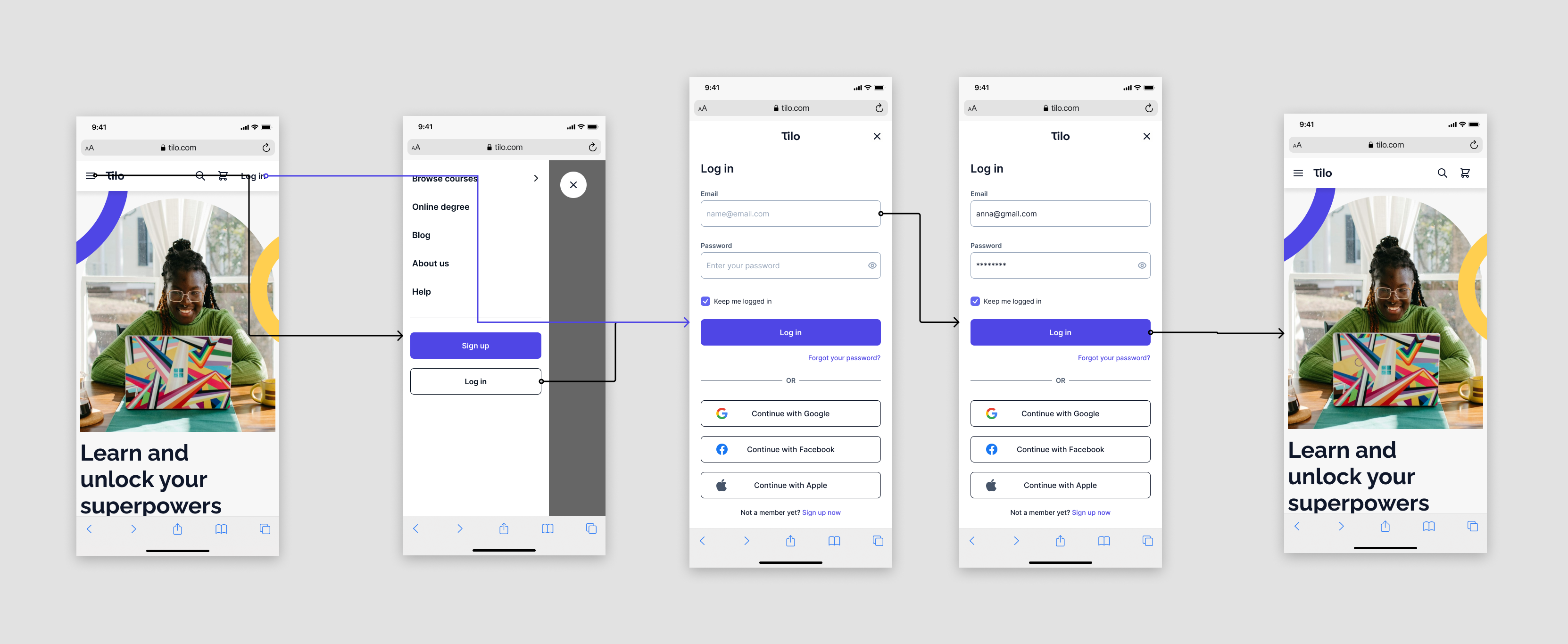
When I designed the mobile screens, I ensured that every clickable element had a minimum size of 44 pixels by 44 pixels to prevent any clicking difficulties. I chose fonts with a minimum size of 14 pixels to ensure text visibility. To make navigation easier, I made buttons taller at 56 pixels, larger than in the desktop version. I chose to focus on taking care of the comfort of current application users, so I placed the "Log in" button on the main screen, allowing direct access to the login screen. Additionally, I added both login and registration options to the hamburger menu.
